
Red bananas grown naturally in Asia and South America are healthier than the average yellow banana, the redder the fruit, the more carotene and the higher the vitamin C level.


Designed by 29 Agency in the US.
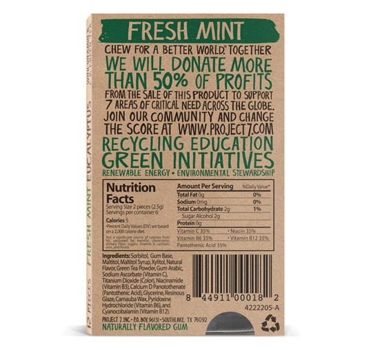
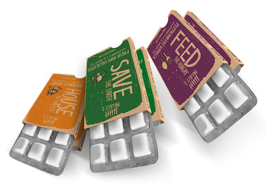
“Project 7 was developed on a cold fall night 2 years ago when the thought of the 7 deadly sins came up. I began to do some research on the history and origin and had a simple thought. What if man in his selfishness instead of focusing on abstaining from the 7 sins worked to help those that were a consequence of one of these 7? What if the “glutton” in this example which I fall into regularly stopped focusing on myself and started focusing on helping those that were starving. So take that concept and spread it over what we call the 7 most critical areas of need in the world, hence the name Project 7. So then the vision started playing itself out and I needed something to help get this initiative out there. So having a consumer goods background and a heart to see real change come about this company was created. I believe like most of you, that if we spent more time helping others, we can in fact, “Change the Score.”Enter Project 7, a consumer goods company passionate about social change and dedicated to addressing the seven most critical areas of need in the world today, as determined by Project 7—Build the Future, Feed the Hungry, Heal the Sick, Help those in Need, Hope for Peace, House the Homeless, and Save the Planet. No matter people’s political affiliations or background, these seven issues strike a chord in the very fiber of mankind”
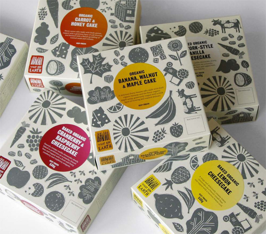
Designed by Mind Design | Country: United Kingdom
“We designed the overall packaging concept for this organic food company. The design uses lino-cut images on a plain background which allows to design different types of packaging for different products easily.”

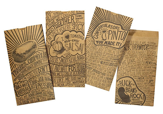
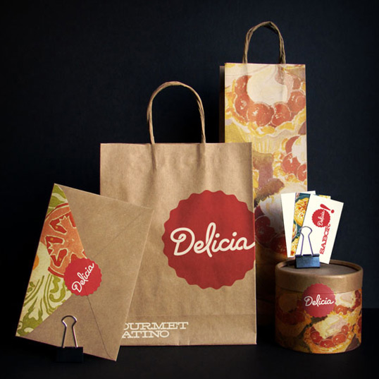
Designed by Sequence | Country: United States
“Chipotle Mexican Grill is one of the fastest growing restaurant-chains in the U.S. Its goal is to change the way the world thinks about and eats fast food by serving high-quality and sustainably-raised food quickly and affordably. We created a new packaging system defined by unique, hand-drawn messages from customers, employees and even ingredients. This lighthearted, passionate approach is a perfect vehicle to convey Chipotle’s ‘un-chain’ philosophy.”
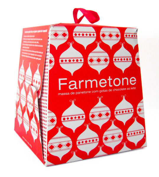
“Farm is a clothing brand with more than 20 stores in Brazil. Every year they design a different package for the Panetone they give to their partners. (Panetone is a tall bread studded with candied fruits and nuts and enjoyed for its light, fluffy texture).They commissioned me to design this year Panetone. They gave me freedom to do what I wanted but I could only use 1 color. They also wanted the package to have something special, with a DIY feel, which relates a lot with the brand. So I came up with the idea of using the bottom of the package as gift tags that you cut and use it as you wish.”
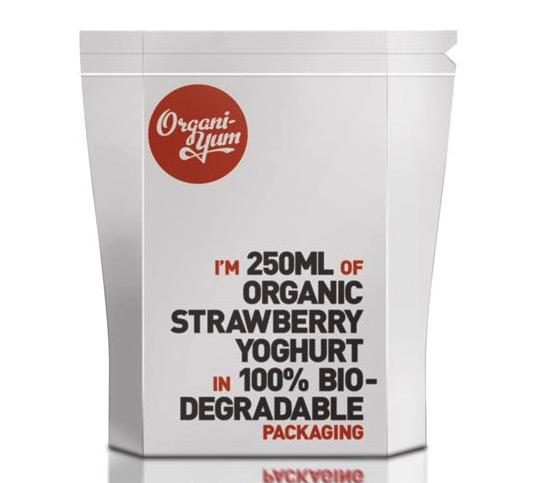
Designed by Timothy Batterham | Country: Australia | Fonts: Metroscript (modified), FF DIN “The brief was to brand and design packaging for Organi-yum. The brief stressed the need for packaging that suited its organic style. This is a Rendering of the yoghurt design, a PLA plastic (biodegradable plastic) film design with a tear top and zip lock to re-seal.”
Designed by Jolin Masson-St-Onge | Country: Canada
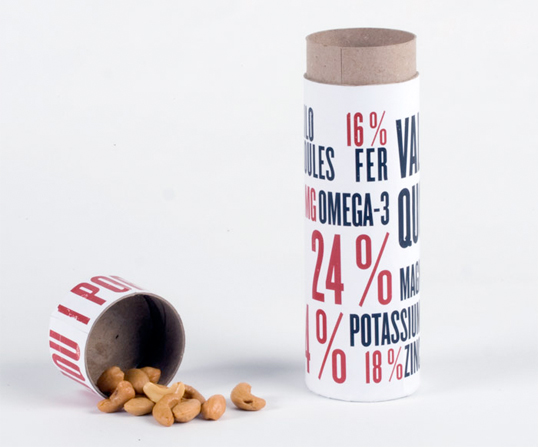
A packaging concept for cashew nuts where the portion size is measured by the lid and the nutritional information of the product is presented in a large, typographic format.
Designed by Tridvajedan | Country: Croatia
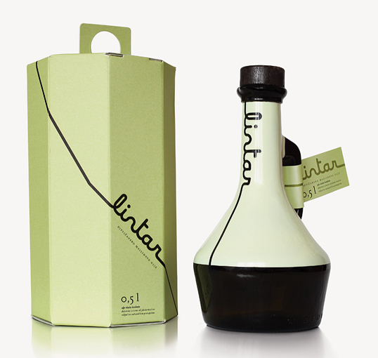
“Lintar olive oil is the product of years of investment of Cemex Croatia Company in sustainable development. On the southern slopes of Kozjak, local oil mill and the Cemex Company together made the project of regeneration by planting indigenous species of olive trees.
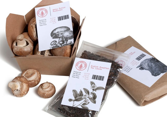
Designed by Bert Bacchus | Country: United States of America
“The Dekalb Farmer’s Market is a loud, bustling epicenter of all things related to eating. I wanted the packaging to feel like you’d visited a port of call and just had your passport stamped. The labels are designed to work with a simple dot matrix printer.”
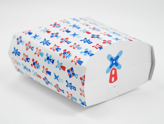
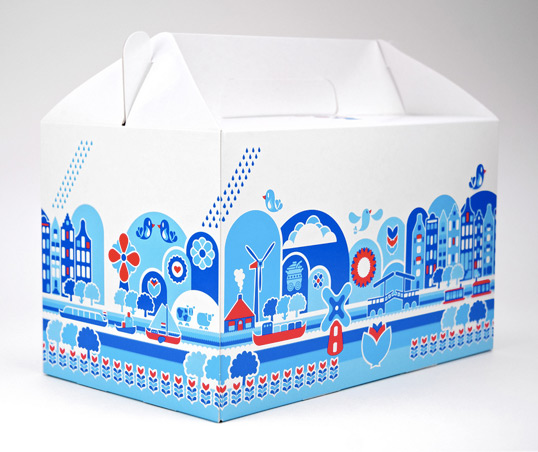
Designed by Mattmo | Country: The Netherlands
“For the Dutch pavilion of World Expo 2010 in Shanghai Mattmo created the food packging design commissioned by Maison van den Boer. We did research to minimise the footprint for the environment. The design is a modern illustrative twist on the traditional image of the Netherlands.”
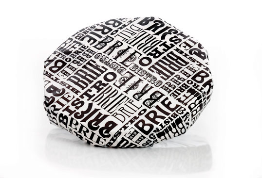
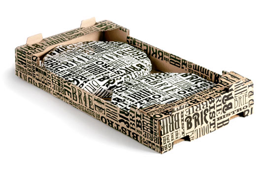
Designed by ID Kommunilkation | Country: Sweden
“Brie Bistro is a traditional quality cheese from Swedish dairy company Skånemejerier. The cheese is mainly sold in whole pieces to restaurants, cafés and catering businesses. Our task was to give the product a new packaging design reflecting the qualities of the cheese and making it stand out from the crowd. The final result is a purely graphic design with inspiration from the beloved French cuisine and old time brasseries.”
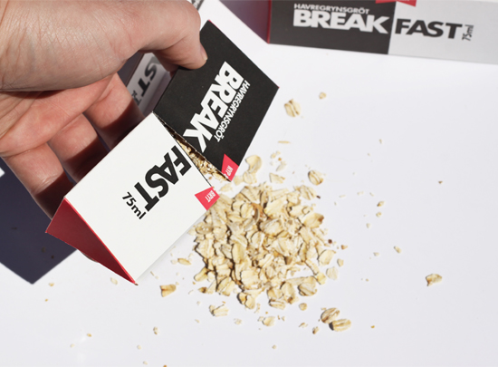
Designed by Niklas Hessman | Country: Sweden
“A kind of taste pack for oatmeal. This package contains the right amount of oatmeal with added sugar and salt. You break your BREAK FAST pack over a bowl, add water and cook in the microwave. Then you can tentatively serve with cold milk. The idea is to target a new audience that otherwise would not eat oatmeal, but also to those who are usually in a hurry in the morning and tend to skip today’s most important meal, breakfast. Break it fast and have a BREAK FAST!”
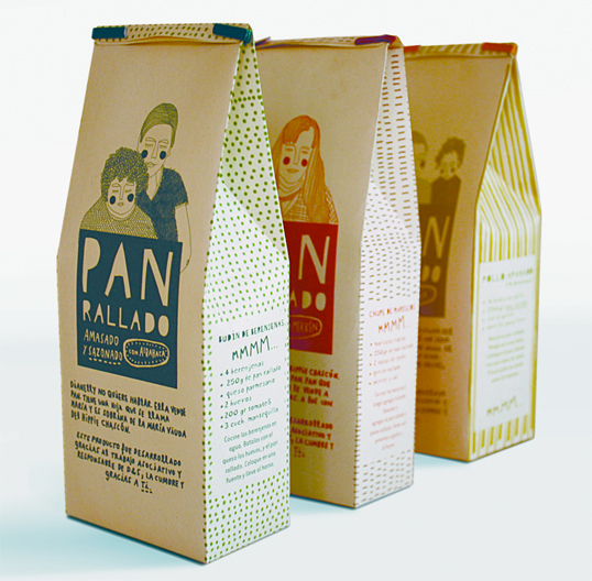
“The objective is to make design a fundamental link among different disciplines to solve a problem observed in the informal sale of food. I propose the creation of grated bread from the surplus of production in the sale of bread on the highways of my country. These leftovers are currently thrown away. The project is also contributing to the inclusion of a lower income segment of society.
The idea of incorporating flavors to the bread responds to current market needs and to a diversification strategy. The flavors chosen were basil, garlic and merken (a Chilean spice).”
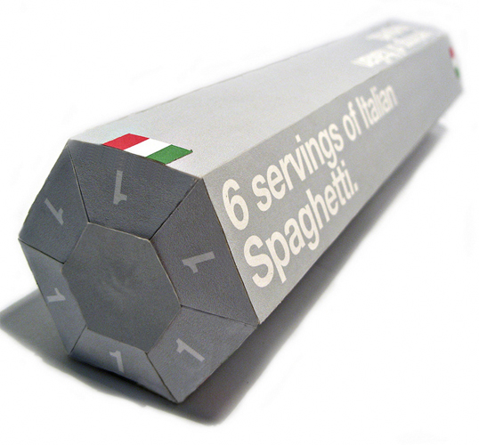
Designed by Neal Fletcher | Country: United Kingdom
“We were asked to choose one of five difficult objects to package, I chose spaghetti. I wanted to address a problem I always have when cooking spaghetti, that problem being that I always use too much. So I somehow wanted to build something into the packaging that aided portion control, so I came up with this Hexagonal Prism, 6 sided; thus there are six servings. It’s refillable and reusable and there’s also the potential for more shapes, for example triangle: 3 servings, octagon: 8 servings etc.”
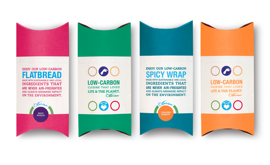
Designed by Pearlfisher | Country: United Kingdom
“Pearlfisher has designed the artwork for food packaging and restaurant menus for new sustainable restaurant chain Otarian – already open in New York and opening in London on 18 August.
Otarian, a new boutique fast-casual restaurant chain, is set to change the face of the London and New York food scenes when it opens this spring, becoming the first global chain to comprehensively carbon footprint every item on its vegetarian menu to internationally recognised standards. The new concept places sustainability at its heart, fusing a passion for the environment with a passion for great food to create a mouth watering dining experience that is also good for the planet.
With the identity already created, Pearlfisher was tasked with creating a secondary visual language to clearly communicate both the irresistibly tasty vegetarian product and the environmental footprint message without distracting from the food.
Pearlfisher Creative Director Natalie Chung said, “Because we were responsible for conveying two messages, we have deliberately kept the design simple, clean and modern. Bold but recognisably ‘foodie’ colours clearly show the choices available. It’s aspirational but accessible.”
Otarian founder Radhika Oswal is a lifelong vegetarian and committed environmentalist, she said: “Otarian is built on the principles of sustainability and vegetarianism and all aspects of the restaurant menu and operations have been developed with these principles in mind. This makes Otarian different from anything else that exists today and, therefore, we needed a really distinctive visual design.
We are delighted with the strong design that Pearlfisher has created for us – it heroes our delicious food while also ensuring that the key environmental messages are communicated clearly.”
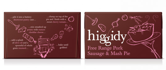
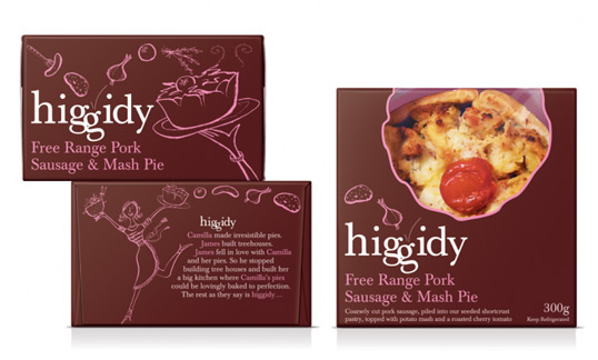
Designed by Ziggurat Brands | Country: United Kingdom
“Camilla Stephens is passionate about pies. She makes really yummy hand-made pies with high-quality ingredients. Uncommon pies, in fact. We loved her pies too and saw the opportunity to open up a market appealing less to your hungry man in a van and more to a discerning female audience. ‘Too nice for the price’ someone called them – probably with a big mouthful of pie.”
Designed by Katherine Low | Australia
“This package and branding ‘Fork Friends’ was created for a local organic deli, promoting fine home cooking with the use of locally produced organic ingredients. They wanted to stand out on the shelves with a modern and clean approach.”


_RED_BANANA_STALK.JPG)
