

Showing posts with label Brief four. Show all posts
Showing posts with label Brief four. Show all posts
Wednesday, 16 November 2011

Monday, 7 November 2011
James Langdon


Visual Editions - Tree of codes


I've
started looking into how a publication can be visual and not use
images. Joe Gilmore showed me this amazing publisher Visual Editions who
believe "that books should be as visually interesting as the stories
they tell" and this book is the perfect example of that. Each page had
been die cut to reveal the right sequence of words to tell a story. It
gives me something to think about in relation to the format of the
publication and how it interacts with the content.
Wednesday, 2 November 2011
Linefeed Reading List
Linefeed Reading List—October 2011 from Michael Bojkowski on Vimeo.
This was a great find and and an even better watch,
seeing magazines in depth that I probably wouldn't
of ever picked up gave me a new perspective on
magazine design and format.


This is a good example of a strong typographic zine cover, I like how the type sits on the right hand side and how the designer has arranged the words to create a narrower column. With my zine I'm going to try and design it solely using type with no image, which I hope I can pull off but I plan to apply colours and artefacts to support the typography.
zine covers


 These zines are a perfect example of a type based publication, not many zines that I was looking at at had such strong typography, mostly hand rendered. There are images in this zine but the type definitely shines through and is strong enough to carry itself. The only problem is I'm starting to think I need to restrict myself a little and make the typography and layout more like a magazine, as in columns and not stray off and start designing an experimental type publication or is that what I should be doing?.
Saturday, 29 October 2011
PARQ
I couldn't like a magazine any more than PARQ.
Every issue is stylistically different similar to how 'The Face' worked. The type and layout is very experimental, and there are pages that I don't quite like where the images push too close the the type.
Friday, 28 October 2011
No.zine by Patrick Fry

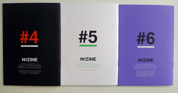


These cool little zines are called no.zines were designed by Patrick Fry. It's a good example of a type focused publication supported by images and type as image. however because of the small amount of type that I will actually be laying out I need to think about how the publication is going to work and how the type will be spread along different pages which then brings up navigation.
oi-poloi - zine - Pica post


Another Zine that I've been looking through is this one from the Manchester based fashion store Oi Polloi title Pica-Post. It's very image based being a fashion zine but there is also a good amount of intelligent type + layout. I have started to think if the use of images would be aid the layout of type and act as a support not as a main aspect in the publication. The use of images would have to be minimal as it is a typography brief for a society associated solely with type.
Shellsuit Zombie - Magazine/Zine


I started to think more into the format of magazines which led me to zines. I think if I was going to go down this avenue I'd have to think about turning it into a series of zines in which 'The waitress' would have an entire publication to itself. This would allow me to take the brief further than just one publication for submission to ISTD and have several publications for module submission.
Thursday, 27 October 2011
Wednesday, 26 October 2011
I've always been a big fan of Grafik magazine and they're love
of typography and I was sad to see it end the other year due to
funding issues and cutbacks. Grafik has now returned and I'm
happy, before Grafik's return they were kind enough to send out
a pdf of the 'unpublished' issue.
The issue itself is very image based, but it is a design publication.
However their is a good solid presence of strong typography which
allowed the images to breath and in places the type itself is cropped
to form an image of itself. These are interesting techniques which
will go towards some good experiments if executed properly.
Elephant Magazine
Elephant magazine can be in part conceptual yet still follow
a typographical structure and I love that. The composition of
type (the elephant in the room) is daring but still conventional
and it sparks an invitation of curiosity and attraction.
Dazed and Confused - Korea
Dazed and Confused even the
Korea version communicates a
contemporary / cutting edge style
through typography and image.
I want to use the same tone with
'The Waitress' magazine and have
an emphasis on 'this is what magazines
might look like in several months'.
ISTD magazine research // Port
The magazine Port debuted earlier this year and from a designers perspective was drawn to it on the shelf straight away. Looking through the magazine you get the distinct feeling that Port have a strong belief in typography, especially strong stand-alone type. Throughout the publication theres a real sense of emphasis on the application of typography in place of image, for example where traditionally they'd be an image or photograph with supporting type on the turning right hand page there is instead a crisp, smartly composed page of typography. This is a good source of research for this brief, I can take away from this the application of type on a full page spread without image and how bold type can create an atmosphere across a publication,
ISTD magazine research
Subscribe to:
Posts (Atom)