Showing posts with label packaging. Show all posts

Tuesday, 23 November 2010

Mobile phone packaging concept

Out of the box - book from adrian333 on Vimeo.


Amazing packaging concept, an interactive packaging idea.

Wednesday, 3 November 2010

Possible Product packaging


Green grocer's I mean Red Grocer's


I've decided to Name my brand 'The Red Grocer's Food Co.' inspired by the tradition that is the green grocer. So I've started to look into the identities of existing green grocer's.

Tuesday, 2 November 2010

Linn Gustafsson


Alas there is a box for apples! A really exciting and original idea to package apples. This is definitely a route I will investigate, boxing apple and other similar shaped foods that I plan to package.

Paradise tropicals


If i do choose to design bags to package my foods there is still the packaging that displays them that needs to be thought about. Usually fruits and vegetable are packaged in open topped boxes, very plain and bland. However this design by Edminson Martin shows that these boxes can be vibrant and exciting.

The crate itself is printed through a 'flexo folder gluer' which is a flexographic process that both prints, creases and glues the box into its final form.

Can all fruit and veg be packaged?


Most fruit and veg aren't packaged but sold loose. Supermarkets and market stalls alike tend to allow customers to choose their loose fresh foodsby hand and then be packaged into paper or polythene bags, (more traditionally in a paper bag) Possibly a new route for my packaging ideas that I should produce bag to package loose fruit and veg.

Banana packaging???


whilst on the hunt for the evasive banana packaging (if it truly exists?) i stumbled upon what one packaging website stated as packaging. Chiquita's new rebrand.

"Chiquita's latest ad campaign imbues its audience with an instant sense of wonder. Using playful illustrations on stickers juxtaposed to the iconic Chiquita stickers, the product and brand become more engaging to the consumer—plus they just look cool. We got a chance to ask the Art Director, DJ Neff, some questions about the process of making bananas (even more) fun."

Fresh food packaging


"Pure Bake Shop is a Toledo based bakery that specializes in gluten free products. The bakery uses all natural ingredients including organic beans, soy, and nut flours for their baked goods. I wanted to accentuate the 'purity' of the bakeshop. The mixture of large, but thin typography, and dot patterns along with the soft vellum packaging create a mood that encompasses the pure aspect on which the bakeshop takes pride"

Found these great packages for fresh food by Michael Gump Jr. Given me some ideas on how to package fresh foods instead of dry goods.

packaged veg


Italian chef Giovanni Ciresa designed these interesting little veg packaging. It has quite an traditional feel about it, how the string holds it together with a modern element of the card packaging.

J Chris Schwartz


"Carver's was a restaurant based on the work of George Washington Carver. The design, typography and materials used in this project were inspired by design from the era Carver's was living. Everything on the menu is a peanut based product and all designs were screen printed on the raw materials. "

I love the range that this design is applied to and that it works across different medias. It's given me the idea to not restrict myself to one material in my range of packaging.

Packaging for Carrots


It took a while but I've eventually found packaging for carrots, baby carrots. The scale of the packaging is obviously a lot smaller than what I will experiment with but this has given me an idea of the form the packaging may take. I like the idea of a crisp pack like format, I'd prefer though to use a nicer material such as paper or card and work around the format.


Monday, 1 November 2010

Respectable?


Selfridges and Waitrose packaging by Lewis Morley, packaging with etiquette. I've decided to research into brands that carry more respect and have an audience with a higher budget and are experienced or adventurous with food. I have to start thinking how to package my foods in a way that attracts my audience and informs them that just because these foods break the normal rules of natural colour association, they are quite healthy and in some cases better for you than the normal more naturally colour associated foods that they are used to.


Thursday, 14 October 2010

Wednesday, 13 October 2010

Project 7


Designed by 29 Agency in the US.
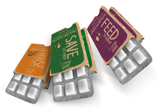
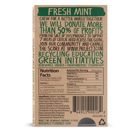
Project 7 was developed on a cold fall night 2 years ago when the thought of the 7 deadly sins came up. I began to do some research on the history and origin and had a simple thought. What if man in his selfishness instead of focusing on abstaining from the 7 sins worked to help those that were a consequence of one of these 7? What if the “glutton” in this example which I fall into regularly stopped focusing on myself and started focusing on helping those that were starving. So take that concept and spread it over what we call the 7 most critical areas of need in the world, hence the name Project 7. So then the vision started playing itself out and I needed something to help get this initiative out there. So having a consumer goods background and a heart to see real change come about this company was created. I believe like most of you, that if we spent more time helping others, we can in fact, “Change the Score.”Enter Project 7, a consumer goods company passionate about social change and dedicated to addressing the seven most critical areas of need in the world today, as determined by Project 7—Build the Future, Feed the Hungry, Heal the Sick, Help those in Need, Hope for Peace, House the Homeless, and Save the Planet. No matter people’s political affiliations or background, these seven issues strike a chord in the very fiber of mankind”


What on Earth


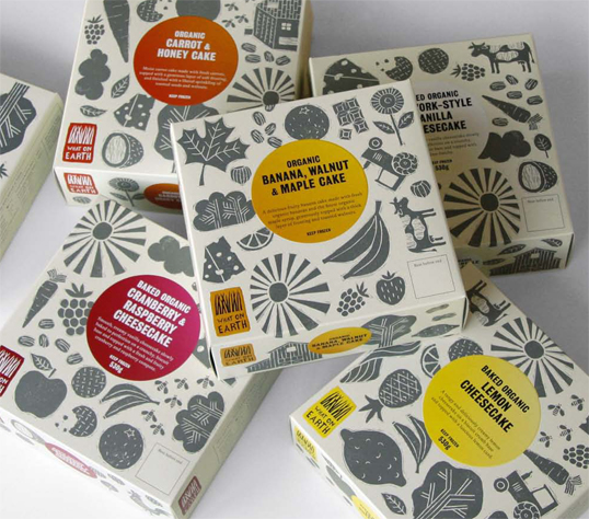
Designed by Mind Design | Country: United Kingdom

“We designed the overall packaging concept for this organic food company. The design uses lino-cut images on a plain background which allows to design different types of packaging for different products easily.”

Chipotle


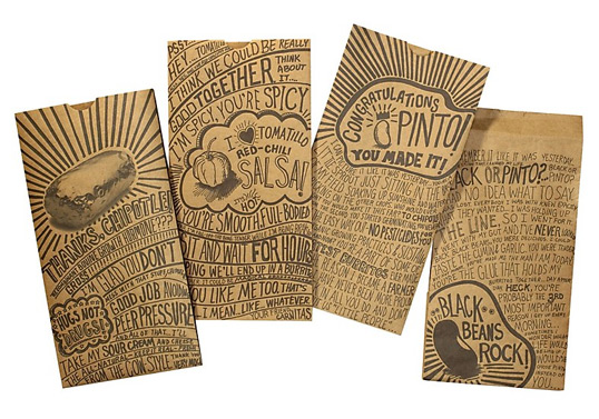
Designed by Sequence | Country: United States

“Chipotle Mexican Grill is one of the fastest growing restaurant-chains in the U.S. Its goal is to change the way the world thinks about and eats fast food by serving high-quality and sustainably-raised food quickly and affordably. We created a new packaging system defined by unique, hand-drawn messages from customers, employees and even ingredients. This lighthearted, passionate approach is a perfect vehicle to convey Chipotle’s ‘un-chain’ philosophy.”
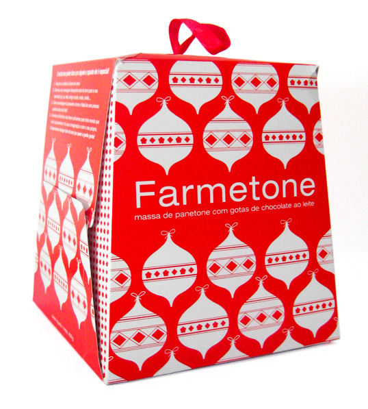


Farmetone

Farm is a clothing brand with more than 20 stores in Brazil. Every year they design a different package for the Panetone they give to their partners. (Panetone is a tall bread studded with candied fruits and nuts and enjoyed for its light, fluffy texture).They commissioned me to design this year Panetone. They gave me freedom to do what I wanted but I could only use 1 color. They also wanted the package to have something special, with a DIY feel, which relates a lot with the brand. So I came up with the idea of using the bottom of the package as gift tags that you cut and use it as you wish.”


Timothy Batterham

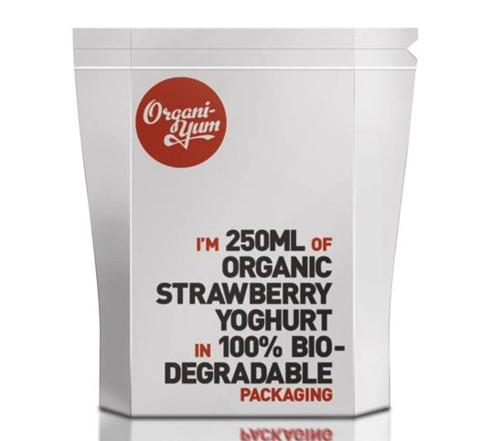
Designed by Timothy Batterham | Country: Australia | Fonts: Metroscript (modified), FF DIN “The brief was to brand and design packaging for Organi-yum. The brief stressed the need for packaging that suited its organic style. This is a Rendering of the yoghurt design, a PLA plastic (biodegradable plastic) film design with a tear top and zip lock to re-seal.”


Jolin Masson-St-Onge


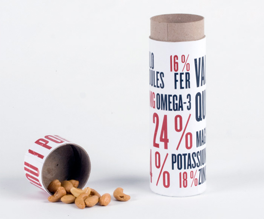
Designed by Jolin Masson-St-Onge | Country: Canada

A packaging concept for cashew nuts where the portion size is measured by the lid and the nutritional information of the product is presented in a large, typographic format.