
Sunday, 29 November 2009
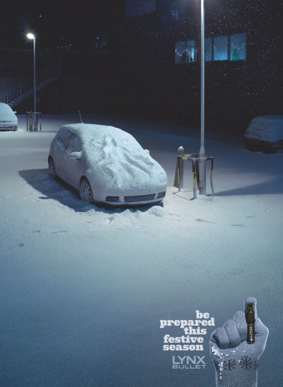
Lynx Bullet
Not leaving much to the imagination, these ads for lynx bullet are pretty entertaining and catch the eye with their sex oriented imagery, if only lynx was this good.


Friday, 27 November 2009


Thursday, 26 November 2009


Saturday, 21 November 2009
Producing Images that effectively communicate a message to an audience, Example 10

communicating and informing that McDonald's Restaurants have Wifi, this is strongly linked to both the technology and the restaurant by using fries to form the internationally recognised symbol for WiFi.
Producing Images that effectively communicate a message to an audience, Example 9
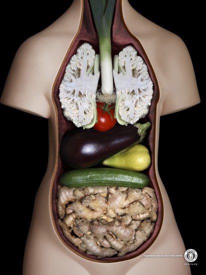
International Vegetarian Union: Anatomy
“Vegetables are all your body needs”
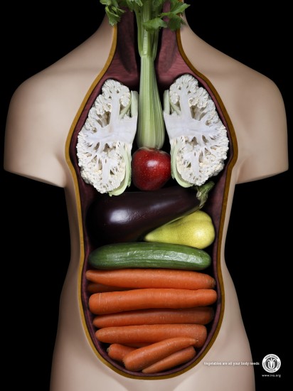
“Vegetables are all your body needs”
visually informing an audience that vegetables make the body function, encouraging and increasing the awareness to eat more vegetables.
Producing Images that effectively communicate a message to an audience, Example 8

Airport sign fluently communicating to an audience where the locations are to specific facilities, i.e. toilets, lost and found and disabled toilets.
Producing Images that effectively communicate a message to an audience, Example 7

Impotence is communicated here through a warped bottle of vodka instead of being solid and straight.
Producing Images that effectively communicate a message to an audience, Example 6

Communicating the powerful imagery behind a Guantanamo bay prisoner, ignorance and naiveness on the publics part is shown to the public, the message here is that torture and in some cases unfair imprisonment is an everyday occurrence.
Friday, 20 November 2009
Producing Images that effectively communicate a message to an audience, Example 5

Using cigs and tab ends to visualise a gun to communicate that smoking kills.
Producing Images that effectively communicate a message to an audience, Example 4
Fsc Logo

A really simplistic design to communicate an environmentaly friendly product.

A really simplistic design to communicate an environmentaly friendly product.
Thursday, 19 November 2009
Producing Images that effectively communicate a message to an audience, Example 3
 t
tThis communicates that someone as come up with an idea.
Producing Images that effectively communicate a message to an audience, Example 2

Communicates "YOU" to the audience by pointing and looking in the direction of its viewer.
Producing Images that effectively communicate a message to an audience, Example 1

Such a smart use of imagery, incorporating the swastika and using it to represent a footballer whilst at the same time still keeping its racist imagery.
Wednesday, 18 November 2009
Interpreting images of the present, past and a range of cultures, Example 10
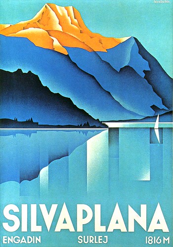
I really enjoy vintage posters, especially ones like this Swiss travel poster. The colours and even the texture of the old style paper gives this poster more depth.
Interpreting images of the present, past and a range of cultures, Example 9
Che Guevera poster
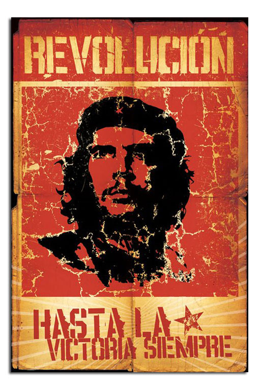
I think Che must be the most printed face in history, everyone recognises hkm, may not know his name but they know his face. The revolutionary inspired thousands if not millions of people and still today his face remains, nightclubs have been named after him t-shirts litter festival shops. The simple black outline of his face is powerful enough to communicate his appearance of confidence and determination. A figurehead in cuban society.
Interpreting images of the present, past and a range of cultures, Example 8

probably the most illustrated guy in the world in the past year, designer after designer re-design the image that is Barrack Obama, the new figure head of sociaty and culture of America in the 21st century.
Interpreting images of the present, past and a range of cultures, Example 7

An iconic logo in modern pop culture, big brother was watched by millions of people everyday (i did find it a bit sad though) the logo itself is smart though, the eye is the cameras that see everything and the black and yellow swirls are the hypnotic controlling element of big brother.
interpreting images of the present, past and a range of cultures, Example 6
Audi - German Thinking/Culture

The design for this is genius, and that goes for most German car firms. If you notice most German car logos a circular or are placed in a circle like vw and bmw. This is to represent ever lasting and never ending, basically the firms want to show that their cars last and in fact are infamous for their enduring quality compared to their French and Italian rivals.
Interpreting images of the present, past and a range of cultures, Example 5
Apple Logo - Consumer Culture

This logo has become an everyday appearance in 21st century society, nearly everybody in the West owns an apple product either it be an ipod, macbook, i phone or an imac. The symbol itself is self explanatory and now requires no type just its own image inside the modern consumer culture and society.
interpreting images of the present, past and a range of cultures, Examples 2, 3 and 4
World War 2 Propaganda posters


This world war 2 propaganda poster persuades people to home grow food instead of using imported foods that required the merchant navy to deliver but were unreliable due to dangerous waters, so the government inspired people to be self dependent. the image is an example of smart design using a ship and a spade together strengthens the concept.
Sunday, 15 November 2009
Interpreting images of the present, past and a range of cultures, Example 1

This contempary print of a past culture is pretty cool, using architecture and images of society from past decades or even centuries inspires and the audience to look back in time when admiring this design.
Saturday, 14 November 2009
The Abiltity to construct meaning from visual images and type, Example 10
Harmony
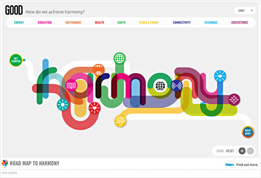
these simple pleasant colours and the slow curving type translate into a harmonious image which is exactly what is intended; a road to harmony. the addition of calming symbols of relaxed imagery intensifies the theme of harmony.
The Abiltity to construct meaning from visual images and type, Example 8
Subist - Tank Magazine

Seeing this style of design really inspires me and spurs me on to create design, i dont like to use the word but i love this style of collage illustration. The illustration itself is built up of religous and human imagery to support the type on the adjacent page. The use of white space is also a technique I admire emphasising the black and grey inks. The visual combined with the type creates a pretty good spread that captures the eye. It's primary purpose to communicate religion and human thinking is successfully projected into image.
The Abiltity to construct meaning from visual images and type, Example 7
Plasticbionic business card

These plastic cards really capture the imagination and communicates the creative design practice of its creator which is it's purpose as a business card, the type if investigated is formed into the shape of stairs symbolising progression and forward moving which relates to the designers forever evolving style.
the Abiltity to construct meaning from visual images and type, Example 6
BIZERTE designed by Andrey Koodenko and Ilya Lovtsov for Shirinskaya A.A, a russian author.

the Abiltity to construct meaning from visual images and type, Example 5
M-A-D Design "Fuelicide"
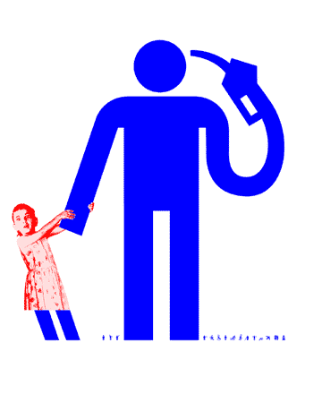
This image portrays the social and political issues of the current world, fuel and the loss of humanity to over-consumption. The design is powerful and emotional but by taking a internationally recognised symbol of man and petrol and combining the two M-A-D have removed the humanity from the image the only hint of life is the red image of a girl struggling to help the man. It is striking and emotional but at the same time isnt shocking so is comfortable to look at so the message is successfully communicated without putting the viewer off with extreme visuals of suicide.
The Abiltity to construct meaning from visual images and type, Example 4
Murrey & Sorrell/Fuel Design

Immediately this print starts the imagination flaring, the form of a human made from books! sat down where books should be read. The 'book man' appears bored with his head in his hand, possibly communicating a world without publications. A really smart example of graphic design.
The Abiltity to construct meaning from visual images and type, Example 3
Inkahoots - Queensland Theatre Company Poster for the youth and education program.

This is how type should look like! This beautiful collage of image, type and pastel colours forms a successful design. Using images from the performing arts layered over letterforms each letter transforms into an independent illustration but together form a exciting visual. The colours grab at the viewers attention creating a stir of excitement for passers by, such a simple design and idea really captures the imagination and thus works successfully in its aim to inform.
The Abiltity to construct meaning from visual images and type, Example 1
Jonathan Barnbrook - Adbusters design anarchy issue (designed by Mike Simons)
Barnbrook 'guest' art directed this issue of Adbusters and with him he brought an edgy fresh style to the publication, this design in particular takes an existing design, if a very terribly bland one at that and took away its function, which was to advertise cosmetics. He reversed the meaning of the ad by totally covering up the face from view and ironically hid the face altogether, dismissing the function of makeup. the design represents anarchy which is of course the theme of the issue, purposely destroying the use of something but at the same time creating something new, a message, which is truly what anarchy is about destroying or mocking the 'existing' and sending out a new message, which has been successfully accomplished here in this design.

Friday, 13 November 2009
The Abiltity to construct meaning from visual images and type, Example 2
Jonanthan Barnbrook - Tomorrow's Truth: Globalisation - corporate fascist.
"Design is both a political and cultural force for change, although mose designers choose not to think about the power it has." J Barnbrook.

This powerful design represents all the corporate power that the 21st century has been home to, G. Bush at one point the most influential and powerful political figure in the world, brought among society corporate fascism, fueled it with taxes etc. Heartless companies and what not preying on the weaker small local businesses to increase profits. This design brings it all together with the powerful imagery of a barcode placed just in the right position to visualize a moustache very much similar to Adolf Hitler, the figurehead of fascism, the design isnt in your face bright colours or any of that jazz just a simple light colour and some experimental type and a subtle placement of an image makes this a striking piece of design.
Thursday, 12 November 2009

Subscribe to:
Comments (Atom)