Monday 26 October 2009

Sunday 25 October 2009

Pomme Chan fOR f5 Magazine (Russia)

The Seed by Goodby, Silverstein & Partners


A really fun video, i really enjoy it because it combines illustration and origami/paper craft with moving image/stop motion its colourful, simple and just fun.

Think HIV identity


Felton Works (the design collective that designed this) chose to tackle the subject of HIV solely with type, a difficult task but successfully done. I like how even though the 'N' is missing and in it's place is a 'V' you still read 'Think'. Another piece of intelligent design that plays with the mind as you read it your reading two words and that's where its strikes and shocks and attracts, the Black and Red is a visual margin that seperates the type into two forms.

McDonald's Sundial


Totally genius idea, to advertise the morning menu of McDonald's Leo Burnett (an advertising agency who also did an awesome chewing gum idea which ill have to hunt down) installed a sundial that pointed to a different item on the breakfast menu until noon when the menu ceased being served... billboard bordering on ambient.


new practices new york 2008 by WeShouldDoItAll


Beat IV by Pentagram


Andrew Rae - Club Flyer


Rae first burst onto the creative scene with his 'perverted Science' Club flyers and has since gone onto design and direct work for The mighty Boosh. The Guardian, The BBC and many others. His illustration is fantastic how he composes his lines and the use of pastel colours on a worn faded paper texture as a canvas works great, his little characters bring the design to life and overall creates an impressive and fun flyer.

Chrissie Abbott's designs for Little boots


Chrissie Abbott is one of my most influential designers at the moment creating beautiful collage designs. The bright galactic shades infused with blacks, greys and whites strengthens the images in the foreground, i love how she incorporates shapes alonngside images creating a psychedelic illustration. Along with her design and use of type these are just amazing to look at and are so skillfully composed.

Glenfiddich barrel art by Johnson Banks


Michael Johnson from Johnson Banks design consultancy was commissioned by Glenfiddich single malt whisky to interpret the length of time it takes for single malt whisky to mature, the result was visually representing what each part of the barrel is responsible for over different lengths of time the shortest being 12 years and the longest being 30. I love the concept and how it uses different parts of barrels to visually communicate time and purpose, the effect is outstanding and looks awesome.


Below represents the whisky that takes the longest to mature, the 30 years,
is represented by the moon and the sun etched and charred onto the lid of a barrel
.
The barrels below spell out 'for 21 years we take a share'.
Over the course of 21 years, nearly half a barrel of liquid will evaporate, legend has it that this is the ‘angel’s share’.

LoAF Record sleeves

Project LoAF by Non-format revisits the sleeve design that is on the brink of extinction due to moving technology, yet these are executed with a twist 3", 5" CDs and 7" vinyls are accompanied with 12" or 16" art prints sealed in plastic and attached to card designs and type are then silkscreen overprinted. The concept works amazingly and the silkscreen method on the plastic surface gives the type an extra dimension of texture and pattern with tiny markings and errors unique to each sleeve.


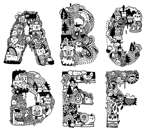
Gemma Correll's illustrative typography


You see it around a lot but i really enjoy this style of forming type and Gemma Correll is one of the best at it, her quirky characters and playful lines and scribbles really make type fun and joyful, simple lines and monotone colour come together to stop it from being too much but it really is just a happy go lucky type.

David Foldvari's Illustrations


Foldvari's style is amazing, his illustrations are constructed primarily from black pen and ink but the subtle inserts of colour explode onto the scene giving it life.


Marion Bantjes's Sugar Type

Marion Bantjes was asked by Stefan Sagmeister in 2007 to contribute to his “Things I have learned in my life so far.” publication. He asked her to re-use the materials and technique she had used for a previous booklet which was sugar to create the phrase “If I want to explore a new direction professionally, it is helpful to try it out for myself first.” She designed the phrase, photographed it and then destroyed it and photographed the result. I love how delicate the lettering is and how legible it is to say its formed from sugar, its a prime example of how to experiment with different materials, i especially like the grainy texture that the sugar creates and that the type is raised of the surface to make itself legible.


And Below some details


Job Wouters AKA Letman

Letman's hand rendered type designs opened my eyes to a whole world of experimentation, and for about a year ive been building in confidence to use markers and inks to create design all thanks to him. His use of bright colours and opacity to layer type is visually attractive. These Dutch club flyers are leagues ahead of any we have littered across leeds.


My dream is to have a shelf this resourceful... if only i had the pennies.